Stock Chart Basics: How to Read and Interpret Market Trends
Stock charts may look overwhelming at first, but they offer a clear picture of a stock’s price movements, trends, and future potential. Whether you're new to investing or refining your stock market analysis, learning to read these charts is essential. A stock chart visually represents price changes over time, helping investors make informed decisions. By understanding different chart types, trend lines, volume, and key indicators, you can better analyze market sentiment and spot opportunities.
This guide covers everything, starting with basic chart structures and progressing through advanced analysis techniques so that you can confidently interpret stock charts. Mastery of these skills will enable effective navigation through the market and smarter investment decisions.
Types of Stock Charts and What They Show
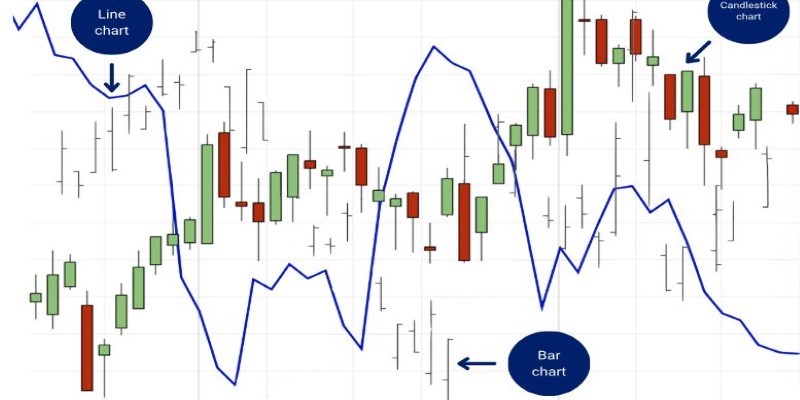
Several types exist in stock charts, although the most widely applied ones are line charts, bar charts, and candlestick charts. Each serves a different purpose and is used based on how much detail an investor might require.
A line chart is the easiest to read. It connects the closing prices of a stock over some time frame to form a line that reveals general price trends. This sort of chart will identify long-term movements but cannot reveal much in detail about what the price actually does within that given time frame.
A bar chart is more specific than a line chart. It has four important prices for each period of trading: the opening price, the closing price, the highest price, and the lowest price. Every bar represents one period of trading, helping the investor see how volatile the markets can be daily.
A candlestick chart is the most widely used type of chart due to its transparency. Every candle shows the opening, closing, and high and low prices in a given period. The color of the candlestick indicates in which direction the price is moving: if it's green or white, it means the price closed higher than it opened, and if it's red or black, it means the price closed lower. They favor the use of candlestick patterns in anticipating potential price reversals or continuations for technical analysts.
No matter which type of chart you use, the goal remains the same: spotting trends, identifying market patterns, and making better investment decisions.
Key Elements of a Stock Chart
To truly understand how to read a stock chart, you need to focus on several key elements. These elements provide critical insights into price movements and market behavior.
Time Frame

Stock charts can display price data over different time frames—daily, weekly, monthly, or even minute-by-minute. Short-term traders prefer charts with smaller time frames, while long-term investors rely on daily or weekly charts to track broader trends.
Trend Lines
A trend line is a straight line drawn on a chart to connect price points and illustrate the general direction of the stock. An uptrend means the stock is rising over time, while a downtrend indicates it is falling. Sideways movement, or consolidation, suggests the stock is trading within a range without a clear direction. Identifying these trends helps investors decide when to buy or sell.
Support and Resistance Levels
Support and resistance levels are key price points where a stock tends to stop moving and change direction. Support is the price level where demand is strong enough to prevent the stock from falling further. Resistance is where selling pressure is strong enough to prevent the stock from rising higher. Traders use these levels to predict potential entry or exit points.
Trading Volume
Volume represents the number of shares traded during a given period. High trading volume often signals strong interest in a stock and confirms price movements. If a stock’s price rises in high volume, it suggests strong demand, whereas a rise in low volume might indicate weaker buying pressure.
Moving Averages
A moving average smooths out price fluctuations and helps identify trends. Investors commonly use the 50-day and 200-day moving averages. When a stock's price moves above its moving average, it's often seen as a bullish signal, while falling below may indicate bearish momentum.
Using Stock Indicators for Better Analysis
Beyond the basic chart elements, traders use technical indicators to refine their stock market analysis. These indicators provide additional insights into momentum, strength, and potential reversals.
Relative Strength Index (RSI)
RSI measures how overbought or oversold a stock is on a scale of 0 to 100. A reading above 70 suggests a stock is overbought and may be due for a pullback, while a reading below 30 indicates it’s oversold and could be primed for a rebound.
Moving Average Convergence Divergence (MACD)

MACD helps identify changes in a stock’s momentum. When the MACD line crosses above the signal line, it’s a bullish sign, indicating potential price increases. If the MACD line crosses below, it signals bearish momentum.
Bollinger Bands
These bands consist of a moving average and two lines above and below it, representing price volatility. When a stock’s price moves close to the upper band, it may be overbought. If it’s near the lower band, it could be oversold. Traders use Bollinger Bands to gauge potential breakouts or reversals.
Putting It All Together: Making Smart Investment Decisions
Reading a stock chart isn’t just about recognizing patterns—it's about piecing together trends, support, and resistance levels, volume, and indicators to make informed decisions. Smart investors use these elements together to assess a stock's potential movement. For instance, if a stock nears resistance with weak volume, it may struggle to break out.
If RSI signals overbought conditions and MACD shows weakening momentum, it could indicate a selling opportunity. While stock charts are powerful tools, they aren’t foolproof. Combining technical analysis with company fundamentals and market trends is key to making smart, well-rounded investment decisions.
Conclusion
Reading stock charts takes practice, but breaking them down into key elements—chart types, trends, volume, and indicators—makes analysis easier. Stock market analysis blends art and science, improving with experience. Charts reveal valuable insights, yet they work best alongside other research methods. By mastering stock charts and integrating them into your strategy, you’ll make smarter investment decisions. Over time, this skill will help you navigate the market with confidence and identify opportunities with greater accuracy.
On this page
Types of Stock Charts and What They Show Key Elements of a Stock Chart Time Frame Trend Lines Support and Resistance Levels Trading Volume Moving Averages Using Stock Indicators for Better Analysis Relative Strength Index (RSI) Moving Average Convergence Divergence (MACD) Bollinger Bands Putting It All Together: Making Smart Investment Decisions ConclusionRelated Articles

Smart Investment Tips to Stay Ahead During Inflationary Times
By - Sid Leonard

How to Effectively Treat a C. Difficile Infection
By - Maurice Oliver

Capital Gains Distributions Explained: What Investors Need to Know
By - Vicky Louisa

Understanding the Long-Term Complications of Lyme Disease
By - Martina Wlison

What's Your Retirement Spending Strategy? A Complete Guide
By - Vicky Louisa

Reasons Why Low-Cost Airlines Might Not Be the Best Choice
By - Sean William

Impossible and Beyond: How Healthy Are These Meatless Burgers for Your Diet
By - Nancy Miller

Boost Your Income: Easy Ways to Make Money From Home
By - Triston Martin

Lease a Car Like a Pro: What You Should Know Before You Start
By - Verna Wesley
Stock Chart Basics: How to Read and Interpret Market Trends
By - Triston Martin

Four Free Things to Do in Nice, France on Your Trip
By - Mason Garvey

Why Do You Need a Primary Care Physician: Key Reasons for Better Health
By - Korin Kashtan